So last week I forgot to update my plan, basically I did some more research for my 3D project then did my self evaluation for my 2D and animation projects.
In today's sessions I'll be gathering up my work and organising it and also working on my 3D project.
Monday, 7 March 2016
Friday, 4 March 2016
Today's Plan
So in today's sessions I'm going to create templates and ideas for my 3D project then do some research for it.
Thursday, 3 March 2016
Today's Plan
In today's lessons I will be carrying on creating more research pages until I finish them then I'll move on to adding annotations to my work and if I finish that I'll move onto working on my 3D project.
So at the end of the day I had completed all the research pages I had liked to and did some annotation, I won't be able to finish them until I finish my 3D so once I do that I'll be able to return to the annotations and finish my work.
So at the end of the day I had completed all the research pages I had liked to and did some annotation, I won't be able to finish them until I finish my 3D so once I do that I'll be able to return to the annotations and finish my work.
Wednesday, 2 March 2016
Personal Logo Research
RealKraftyy's logo is a bowl that has a pair of scissors in it with a beard and shutter shades. The bowl with the scissors represents a "Bowl Cut" which is a very odd hairstyle that he had done when he reach his first subscriber goal on Twitch, the beard is there because that's one of his main features and the shutter shades are an accessory he uses for special stream events. I like this logo as it combines characteristics and objects that make up Kraftyy and displays them as a clean logo.
VanossGaming's logo is very simple and bold and that's what I really like about it, he takes his channel name initial's then puts them in black and white bold print with some editing and it's clear and simple, another reason I like it is that it looks professional and clear.
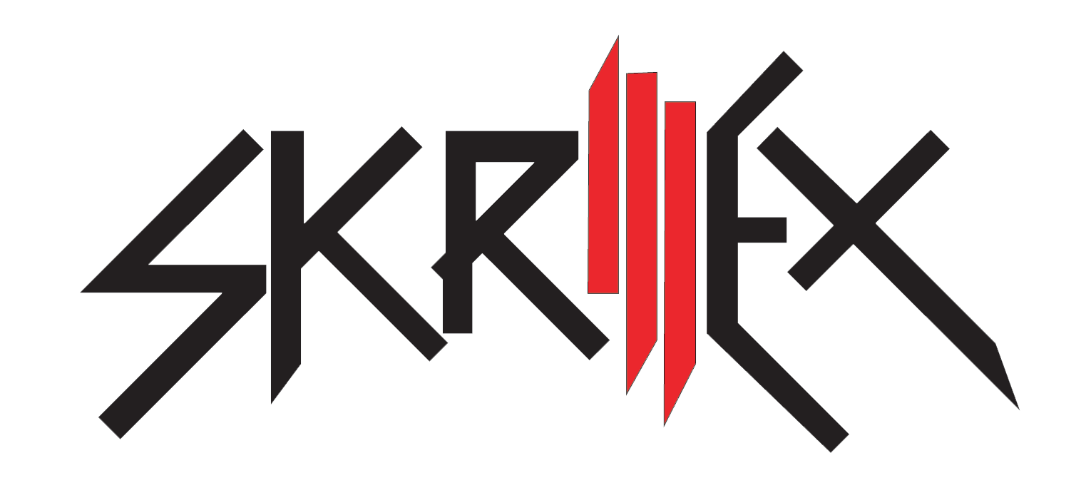
Skrillex's logo is very good as there is plenty to it, the jagged rough text is used as he is a Dubstep artist which is based around heavy and jagged music, the I and two L's are highlighted red because he used that as his logo for many things and it's what he's recognised by on clothing & items etc. I really like this logo as it represents the type of person he is and what he does for a living and it's also a very nice and clean design which is easy to understand and still looks professional, it is also a universal logo as he can use all the text for banners, clothes, CD cases etc. but he can also just use the I & two L's for everything as well.
Today's Plan
Today in college I am going to create research pages and annotation pages based on artists and my own work for pretty much the entire day, if I finish earlier then I will continue to do my 3D side of my project.
So at the end of the day I had done a few research pages, I didn't finish quite as many as would have liked to have done but I got a good amount done nonetheless. I think what took up some time is me making my pages lay out as best I could and getting the typography how I like it.
So at the end of the day I had done a few research pages, I didn't finish quite as many as would have liked to have done but I got a good amount done nonetheless. I think what took up some time is me making my pages lay out as best I could and getting the typography how I like it.
Subscribe to:
Posts (Atom)


